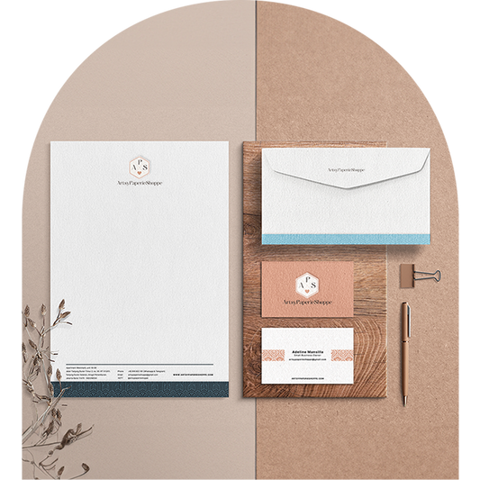
Hey there, Artsies! You know, there's nothing quite like the feeling of refreshing your space, especially when that space is the digital home of your passion project. The ArtsyPaperieShoppe website has gotten a pretty cool makeover, and I'm super excited to share it with you!
You might be wondering, why the change? Well, over the past six months, I've been pouring my heart and soul into giving ArtsyPaperieShoppe a new look. I wanted something that screams "classic" but still feels clean, feminine, and more in line with who I am today. I've been absolutely loving this color palette lately. It's got this quietly luxurious vibe that I think perfectly captures the grown-up, refined side of our ArtsyPaperieShoppe journey.
So far, I've jazzed up our logos, our website, and our banners, and I'm so thrilled with the results. It's been a labor of love, but seeing the brand's evolution right before my eyes makes it all worthwhile.
But we're not stopping there! Next on the list? Social media. I can't wait to bring this fresh, new vibe to all of our social media platforms. It's a big task, but one that I'm totally ready to tackle. Remember, a brand is more than just a logo - it's an experience. And I want to make sure that wherever you encounter ArtsyPaperieShoppe, you're getting a consistent, engaging, and totally cohesive experience.
So, this is where we're at. The new, refreshed ArtsyPaperieShoppe. It's still a work in progress, but isn't that the beauty of it? We're all on this creative journey together, and I can't wait to see where it takes us. So, come on over and check out the new ArtsyPaperieShoppe. I'd love to hear what you think!

Remember, creativity isn't a destination, it's a journey. And I'm so grateful you're here on this journey with me. Let's create some beautiful things together!


